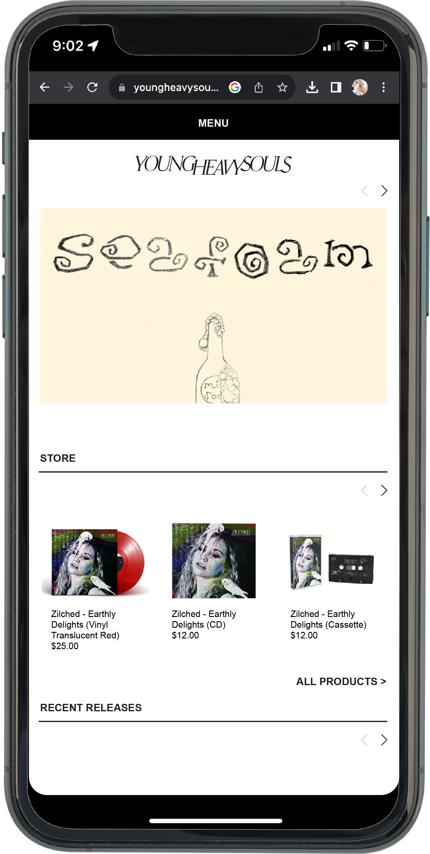


Young Heavy Souls is an independent record label and music publisher with Detroit roots, embracing a wide sampling of hip-hop, indie and electronic sub-genres. In this rebrand, they wanted to realign the visual branding with where the label is today.


Original Logo

2023 Stacked Logo

Some things that stood out in initial conversations were themes around alchemy, and a modern voice that still felt like real people. We got there with a foundational stately serif typeface and custom embellishments and design elements that made it all feel a little more tangible.


Color and type had to act as consistent, minimal building blocks for more complex brand and artist creative.
It should be a brand you can live with, too.


Visit youngheavysouls.com and follow them on social to stay up to date on your next favorite artists.
